Ahmet Bugra Avcilar
The impact of the new Desktop Checkout experience
As we examined the previously established funnels, we noted an approximate 30% in both navigation speed and the completion of tasks or funnels.
Overview
Modanisa is a fashion e-commerce platform that is focused on women’s fashion. It serves in 6 languages, sell 500+ brands and ships to over 130 countries.
- My role: Product Designer
- Platforms: Web
- Year: 2018 - 2020
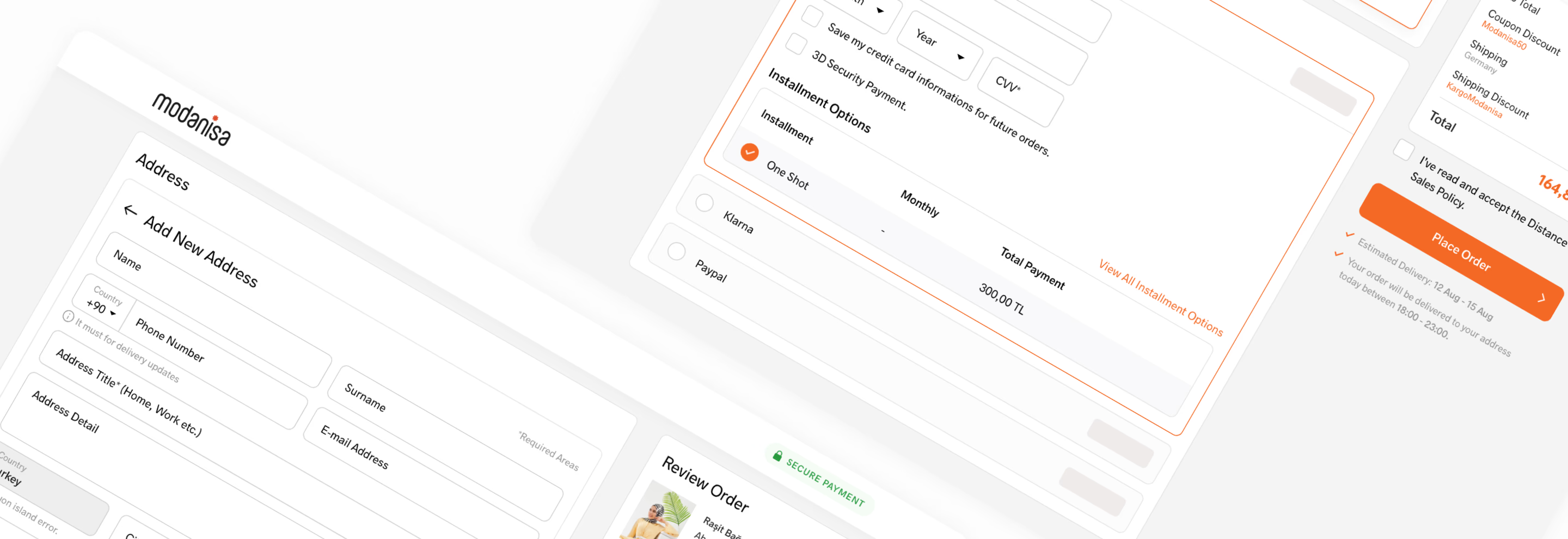
What
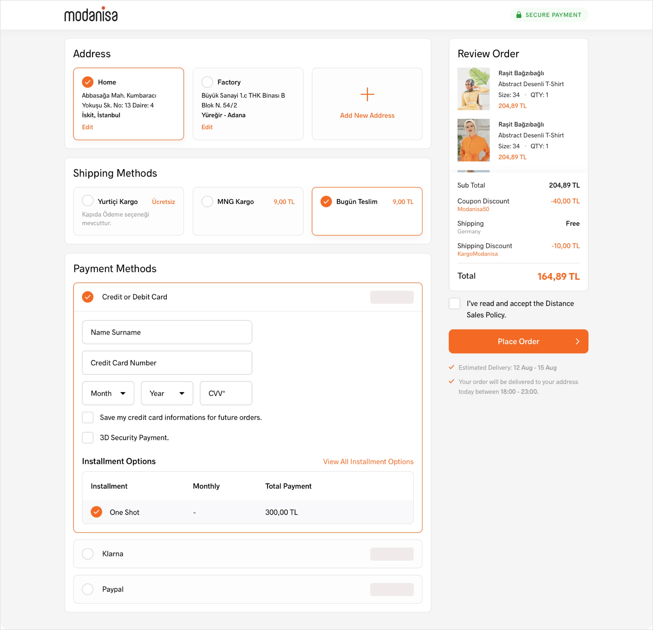
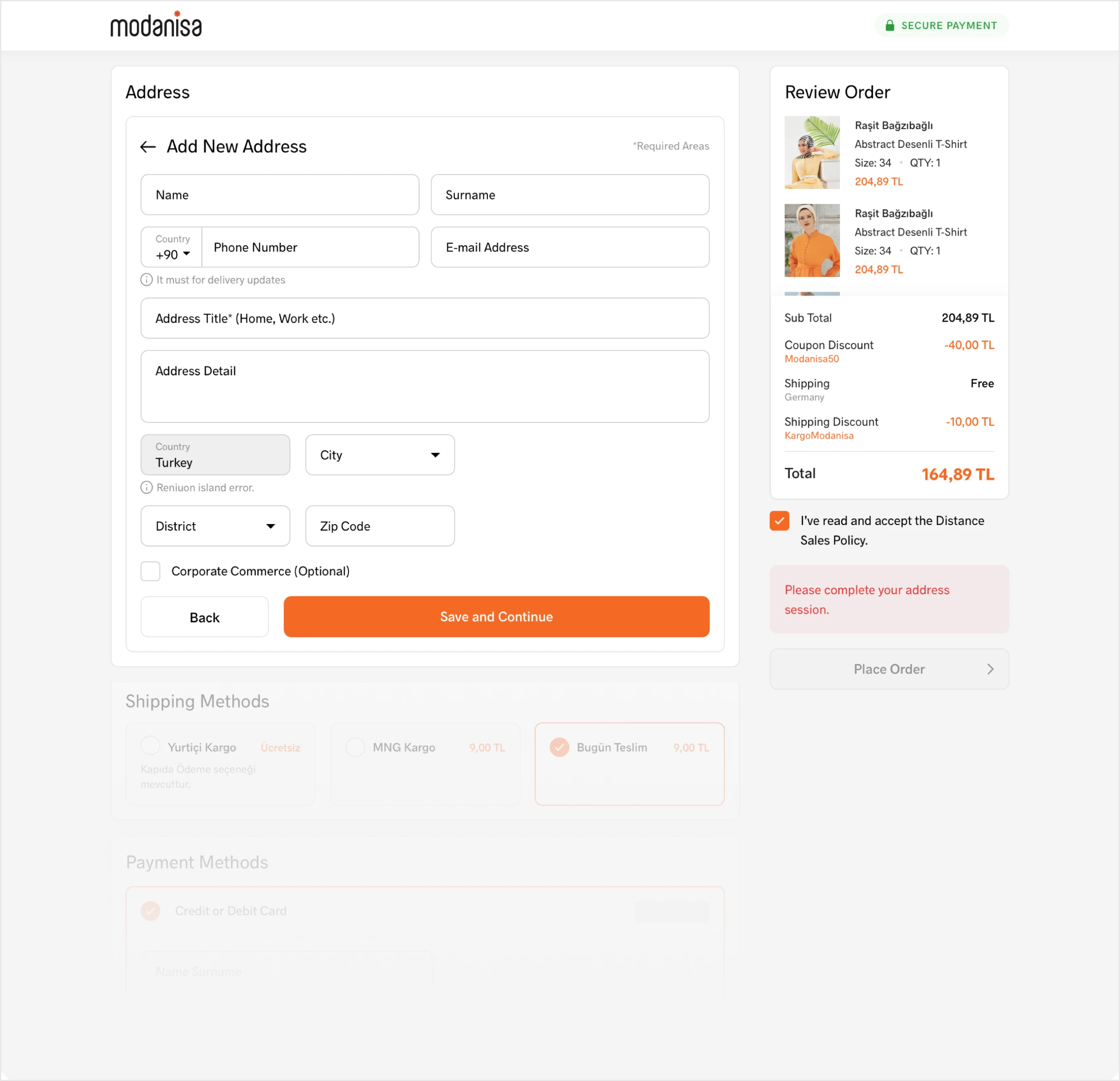
We completely revamped the outdated Checkout flow in terms of both the interface and user experience, and launched it live through A/B testing to optimize it to the fullest extent.
Who
I worked with one project manager and my other designer colleagues. Throughout the entire process, we were in close communication with the development team.
Problem
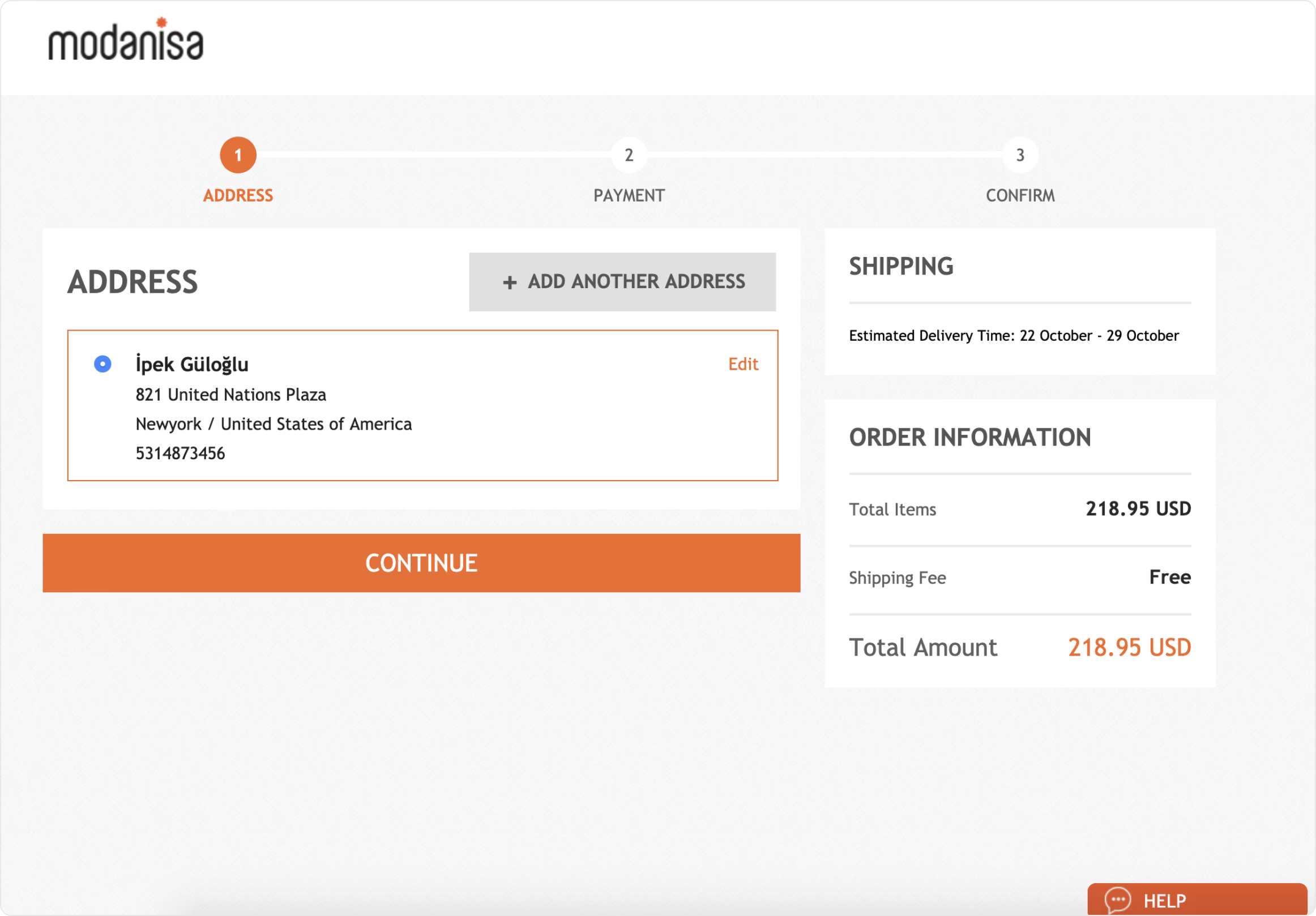
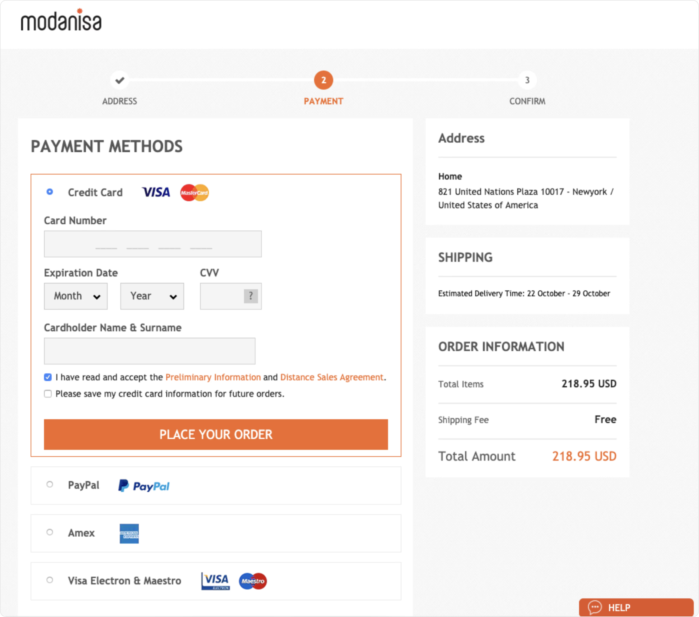
There was a two-stage checkout process consisting of address and payment method. The problems with the existing design were as follows:
- The UI was quite outdated.
- The products to be purchased were not clear.
- Splitting the address and payment method into two stages could result in information loss between the stages.
- More than 10 payment methods were used in multiple countries, and not all of these payment methods followed our own interface. It was very difficult to capture the correct directives.
- The design patterns were weak and the design had been deployed live without being tested with users previously, making it a utopian design.
Market
Online retail sales amounted to 4.9 Trillion U.S dollars worldwide and it’s forecasted to grow over 50% until 2026. According to companies, retail sales revenue from physical stores are almost equal to their digital sales.
Competitors

The way of the solutions
Benchmarking
Since Modanisa sells to over 100 countries worldwide, we were comfortable benchmarking Modanisa from popular ecommerce platforms in each country. Of course, at some point, we needed to achieve a global UX. So, we experimented with small details through small A/B tests and deployed the best-performing one
Creating the new information architecture
Having a platform that we tracked data on beforehand was very helpful in understanding our users when creating the new UX architecture. Additionally, by tracking hundreds of sessions through Hotjar, we initiated the revamp process based on that.
Design and prototyping
Instead of conducting one-on-one user tests for the new design, we leveraged our high user traffic to run multifaceted A/B and split tests. Additionally, before the A/B test, we created a prototype to ensure alignment within the product and technology team and to avoid functional issues, testing it with many people.
High fidelity design and development complexity
We maintained a strong communication with the development team while creating the designs because our goal was to bring the most effective solutions to the product. We proactively discussed the challenging aspects of the design with the development team, gathering their input. This allowed us to quickly align and bypass a significant amount of research effort. During this period of designing in Sketch, we used Zeplin for development handoff. As a result, we often grouped each flow into separate categories, wrote explanations, and handed them off to development in this way. Additionally, we had a Dropbox document that included user flows and necessary prototypes as supporting materials.
Shipping and testing
We initially launched the new design to 40% of a country where we receive substantial traffic and users have the highest duration time. We observed this segment for an average of 2 weeks. Subsequently, we gradually rolled out to all other countries in phases to create samples. Throughout this process, I closely collaborated with the Conversion Ratio Optimization team. We monitored the metrics for each flow using Google Analytics and Hotjar to validate the designs.
Result
Conversion Rate (from Checkout) (7-20 Jan 2020)
- Old version: 69.7%
- New version: 77.6%
- Uplift ✅: 11.3% improvement
Exit Ratio Comparison (7-20 Jan 2020)
- Old version: 6.30%
- New version: 6.0%
- Uplift ✅: 5% improvement
Avarage Time Spend Comparison (7-20 Jan 2020)
- Old version: 2m 32s
- New version: 1m 37s
- Uplift ✅: 36%
⚠️ The numbers are calculated only for users coming to the checkout page. Results do not reflect overall number of sessions or users.
Screens
New design
Old design